Atratus
Defining the identity of a premium AI consultancy
Client:
Atratus
Year:
2025
Type:
Brand Strategy, Visual Identity, Website Design
Overview
Atratus is an AI consultancy founded by senior industry experts. As a new company, they needed a brand that reflected their positioning.
Premium. Reserved. Credible.
I partnered with the founders of Atratus to design the brand and digital foundation for the company’s launch, positioning the consultancy as a premium and highly credible player in the AI industry.
Challenge
The challenge was not visibility, but perception. Atratus did not need to compete for attention or drive traffic like a typical agency. Instead, it needed to establish itself as a premium, trusted brand for a discerning audience. This meant creating an identity and experience that feels refined, reserved, and intentional while still clearly communicating capability across brand, website, and core business materials.
Approach
The approach centered on building a complete and controlled brand system. Starting with strategy, we defined how Atratus should be perceived positioning it as selective, confident, and understated. This translated into a minimal visual identity, precise typography, and a restrained color system. The same thinking extended across all touchpoints including the website, presentation decks, and document templates ensuring consistency, clarity, and a unified tone throughout.
Solution
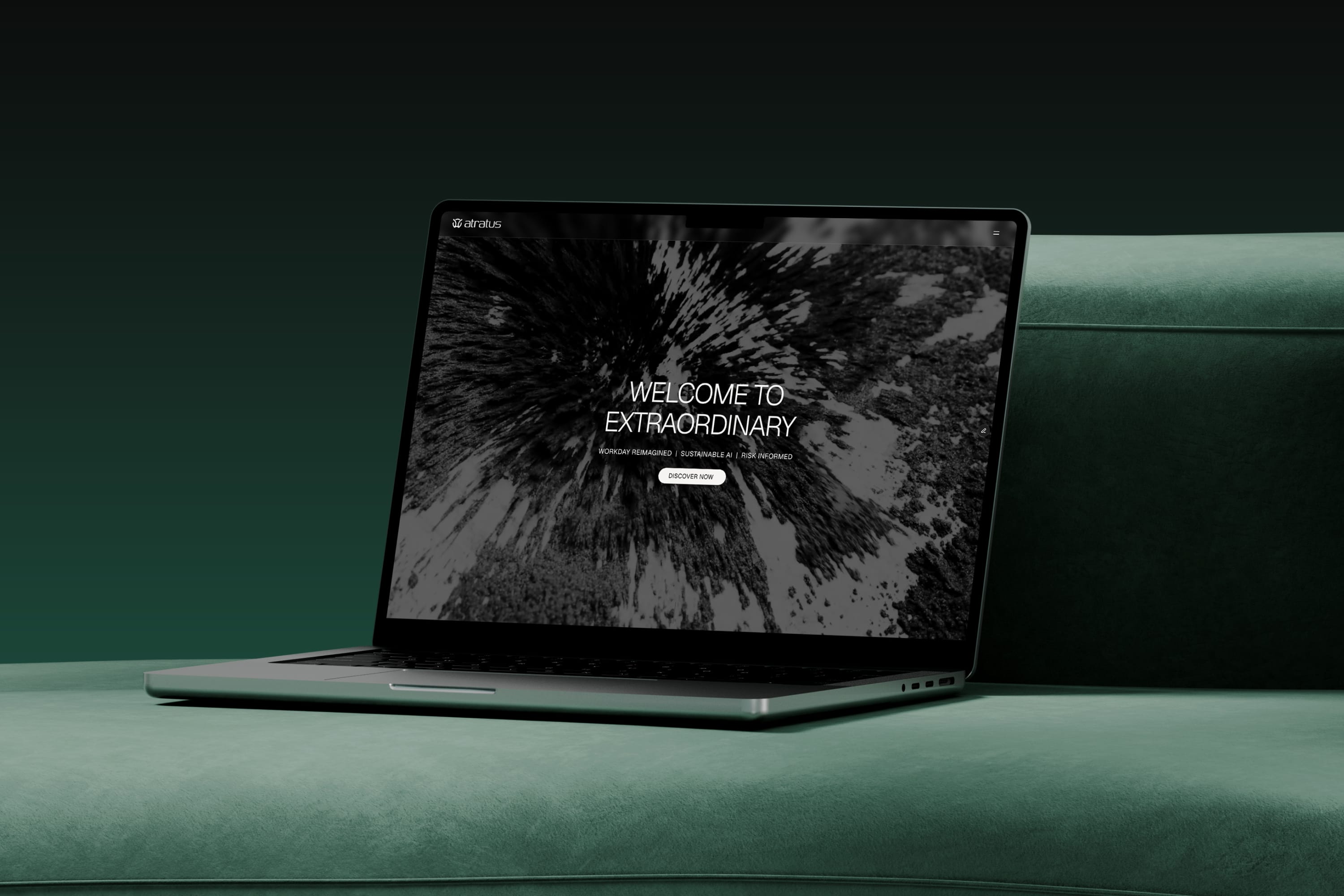
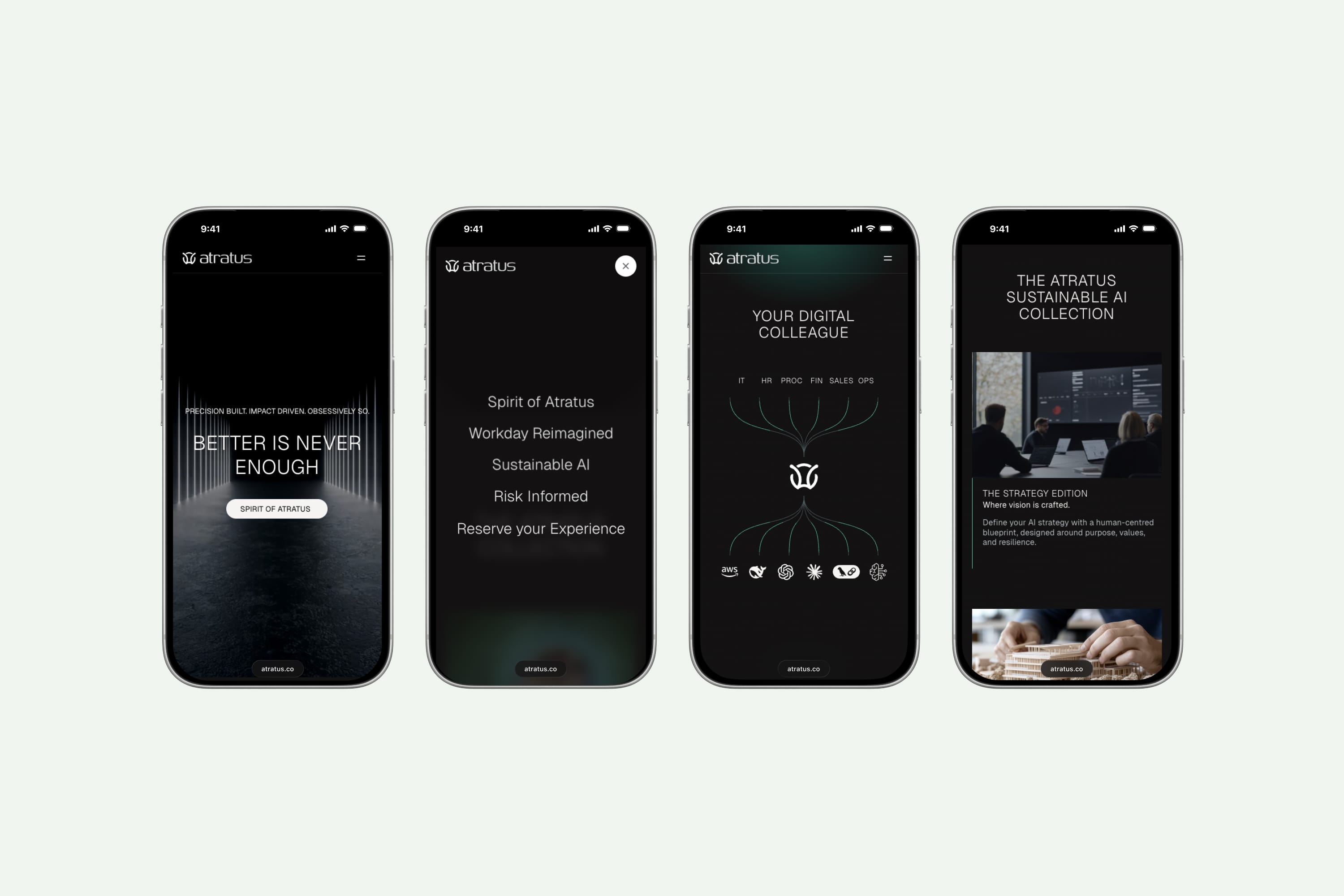
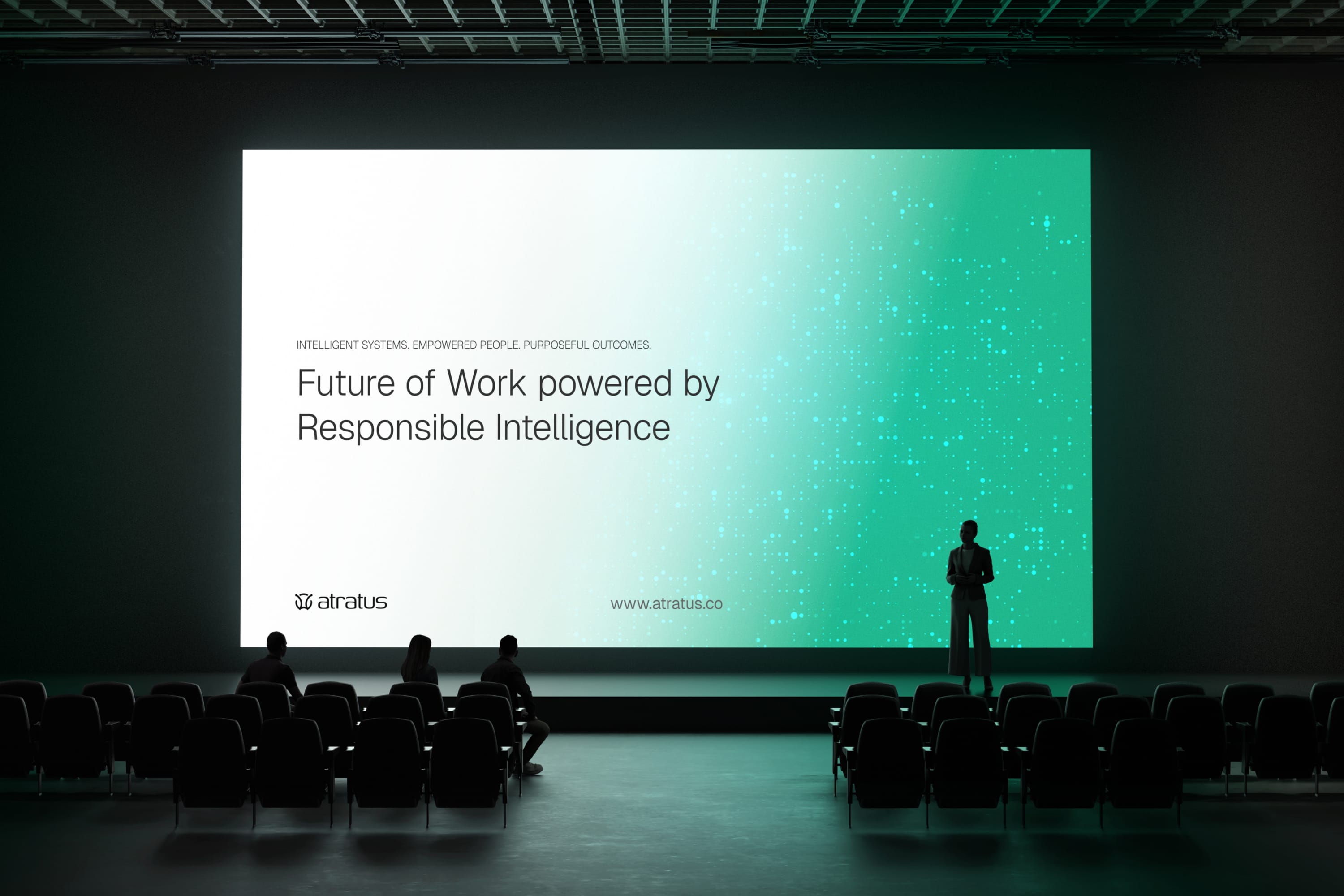
Atratus launched with a distinctive identity that stands apart from typical AI consultancies. The premium visual language reinforced the experience and authority of the founding team. The website and brand launch helped attract initial traffic and user sign ups while establishing a strong first impression.
A minimal digital experience designed to reflect the brand’s premium positioning.
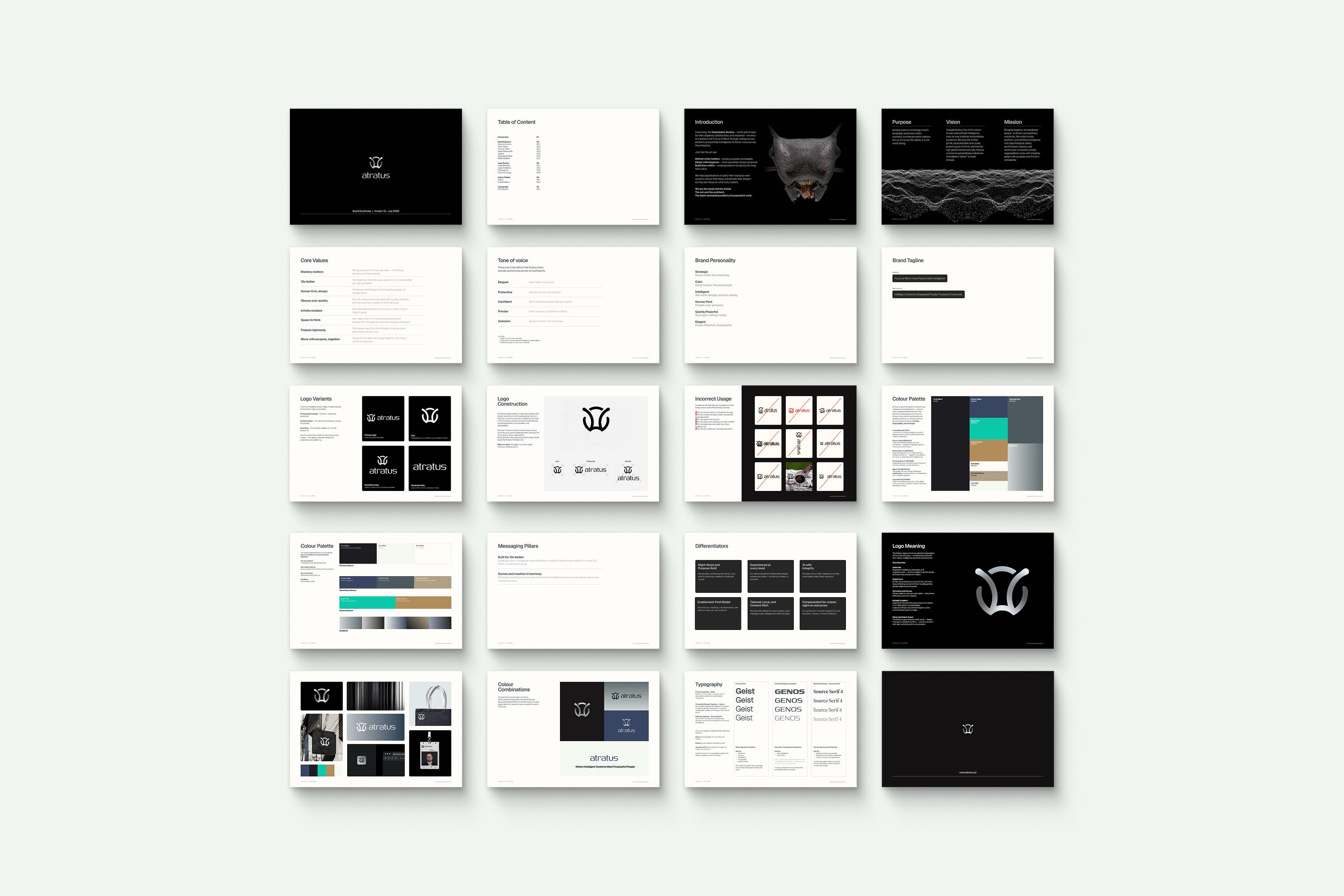
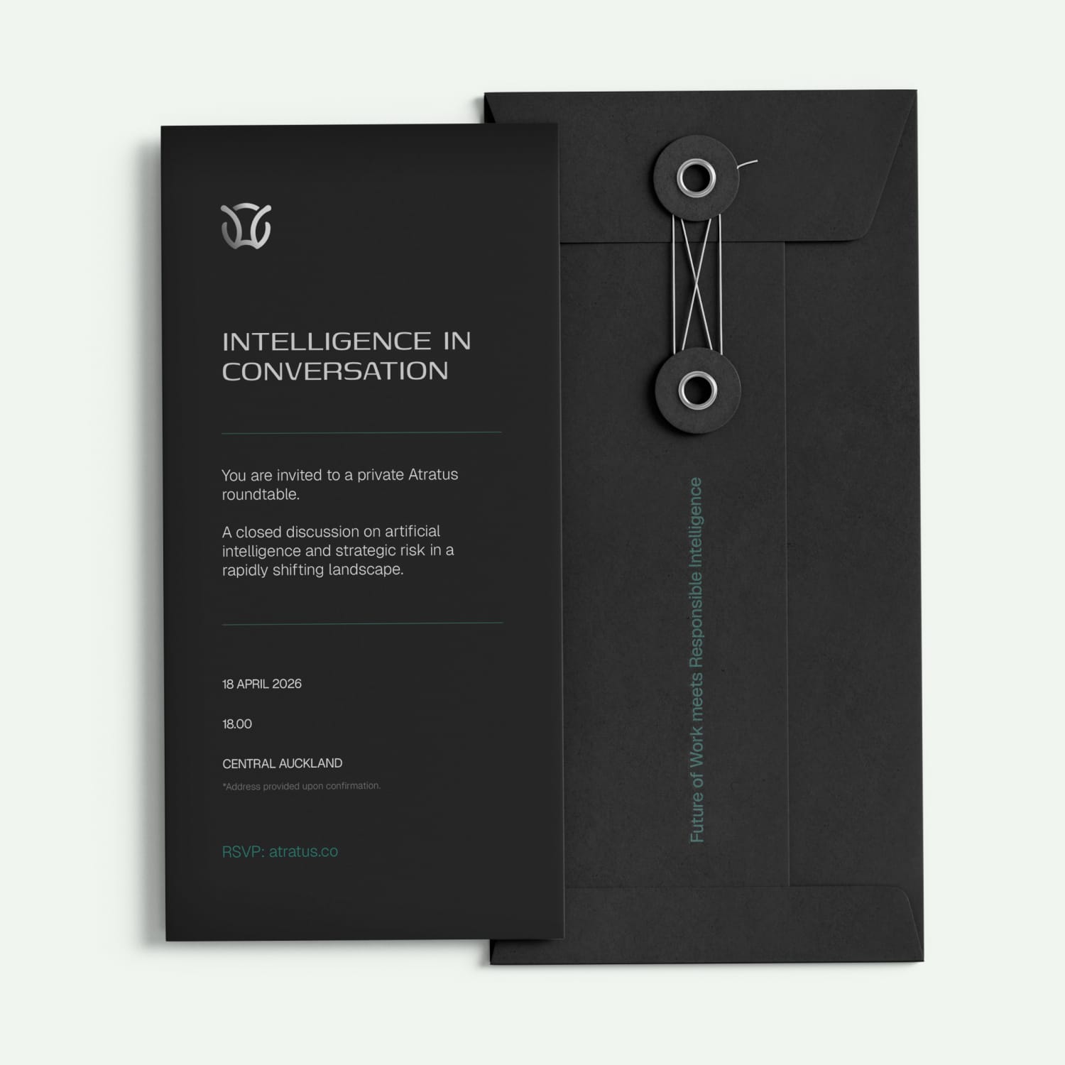
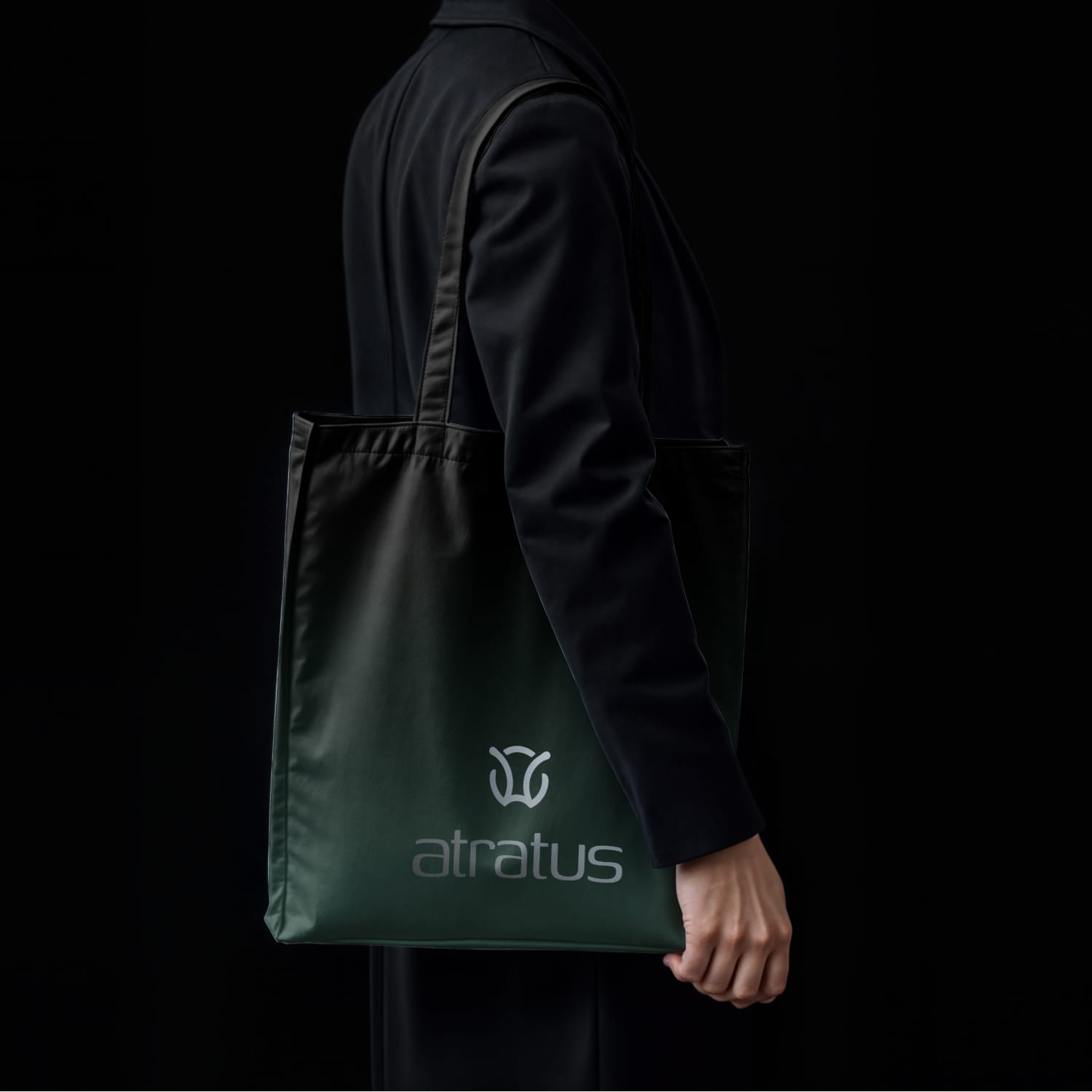
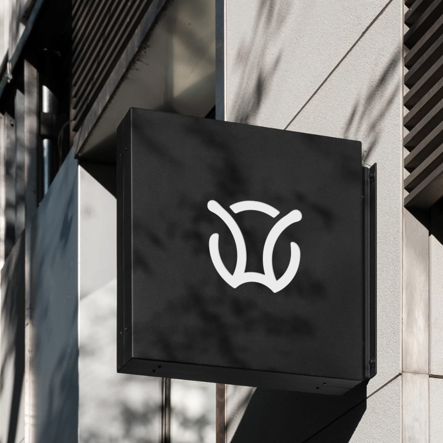
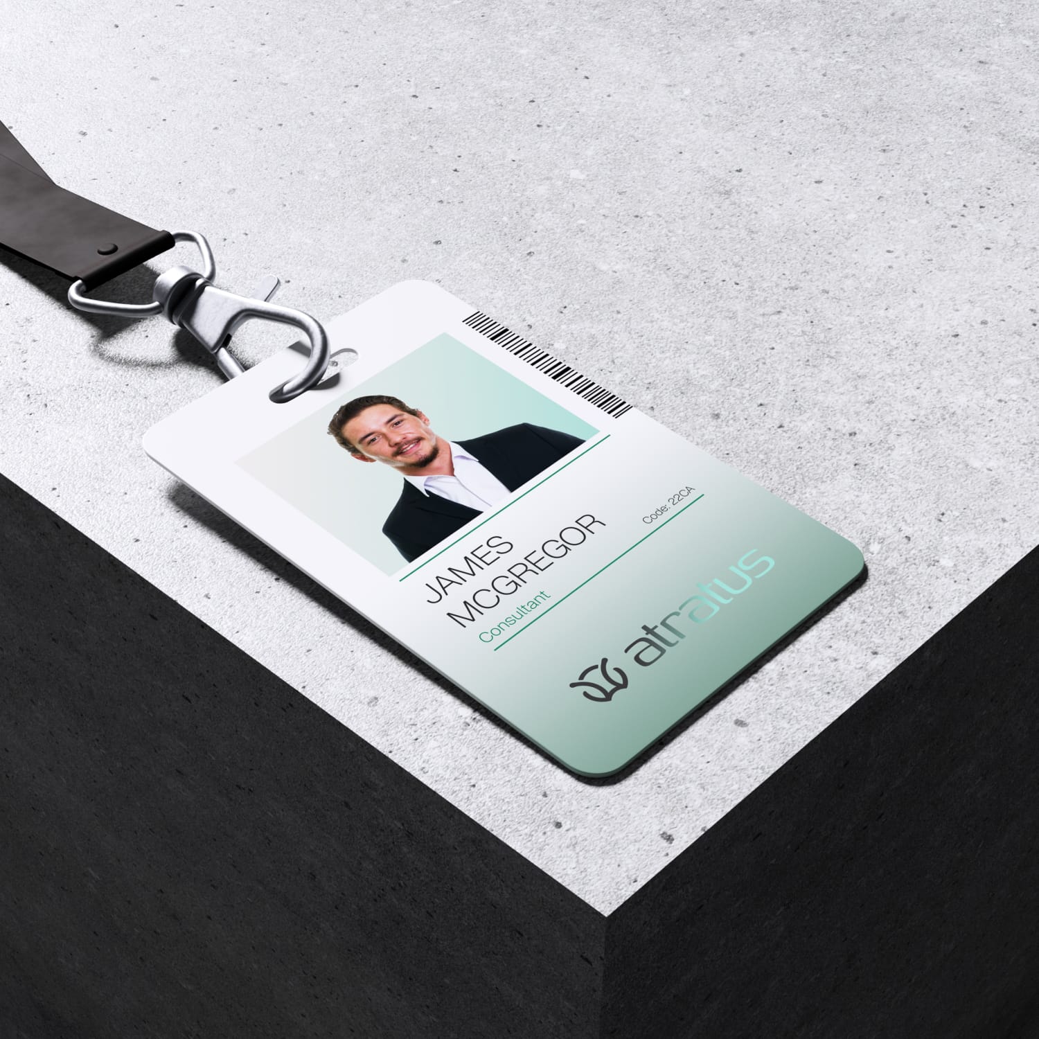
Visual Identity
The Atratus identity moves away from the loud aesthetics often associated with AI startups. Instead, the visual language focuses on restraint, clarity, and sophistication to reflect the senior expertise behind the consultancy.
The system combines refined typography, a controlled colour palette, and minimal compositions to create a brand that feels premium and credible. Every element was designed to work consistently across digital platforms, presentations, and brand communications while maintaining a distinctive and confident presence.

Building Atratus reinforced the value of restraint and intrigue in brand design.
Working on Atratus showed how powerful minimal and intentional design can be when positioning a premium brand. Every decision needed to balance sophistication with clarity while ensuring the identity remained practical across digital and communication platforms.
The project also highlighted the importance of designing a complete brand system rather than isolated assets. By creating a cohesive toolkit across identity, website, and brand materials, Atratus was able to launch with a consistent and confident presence from day one.