Eyebuydirect
Evolving the visual identity of a global e-commerce eyewear brand
Client:
Eyebuydirect
Year:
2022
Type:
Visual Identity, Brand Strategy, Art Direction

Project Overview
Eyebuydirect is a global e-commerce eyewear brand offering stylish prescription glasses at accessible prices. As the brand expanded rapidly across digital channels, maintaining a consistent and engaging visual identity became increasingly challenging. The project focused on evolving the brand’s visual communication to feel more lifestyle driven and relatable while still supporting high performing campaigns.
My role involved shaping the visual direction across campaigns, website assets, newsletters, and marketing materials to create a more cohesive and engaging brand experience.
The Challenge
Eyebuydirect operates in a highly competitive online eyewear market where strong visual communication plays a key role in customer engagement and conversion.
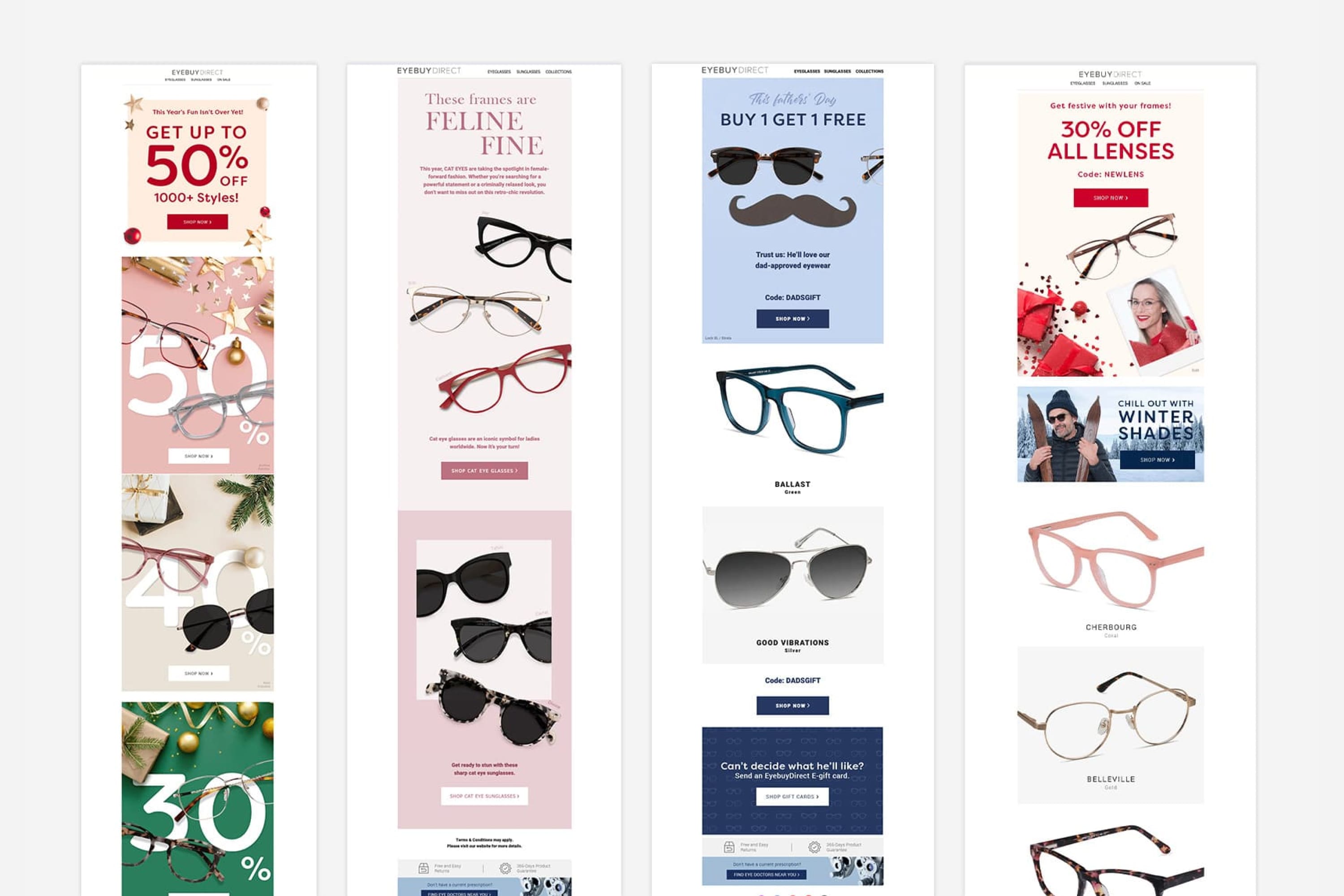
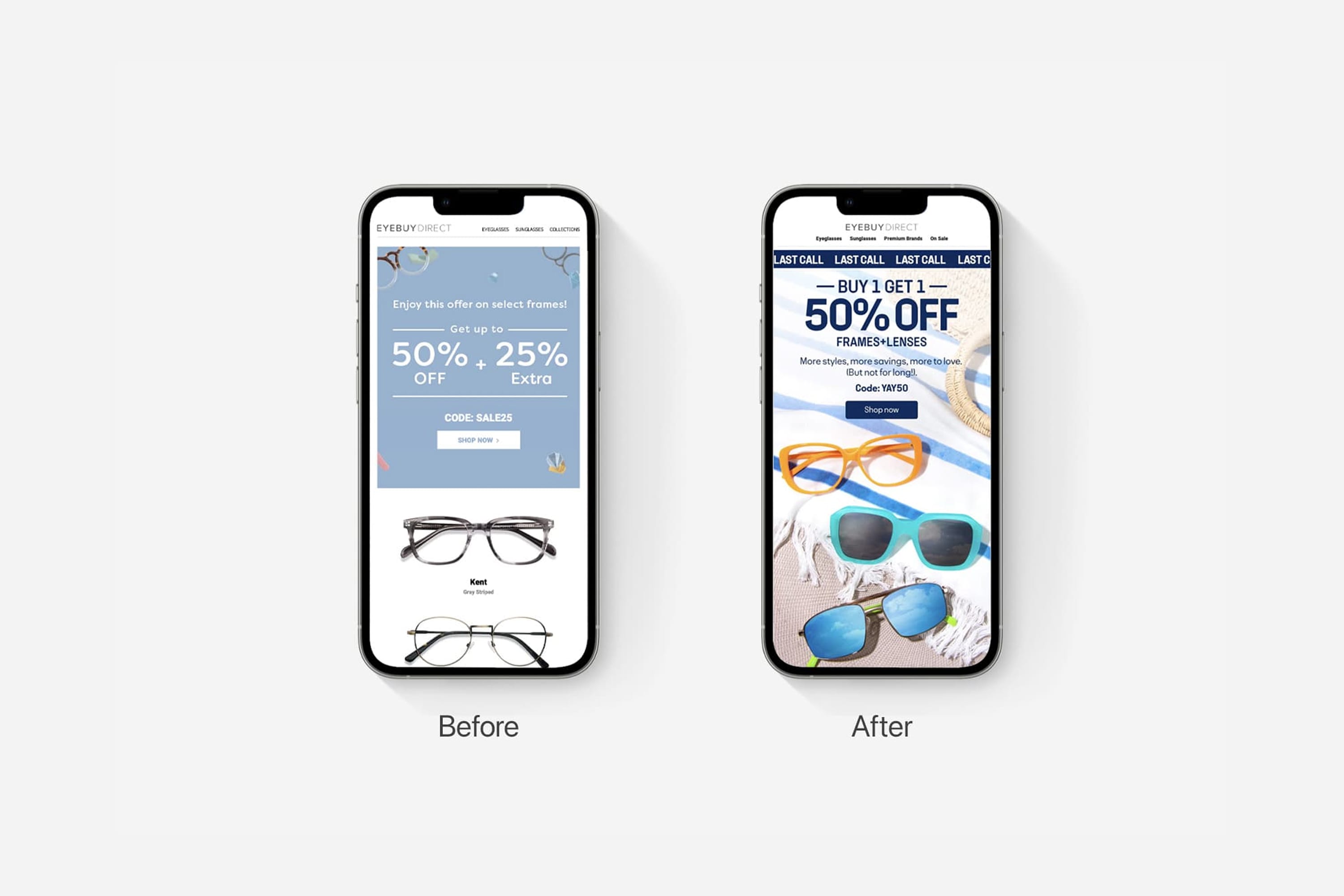
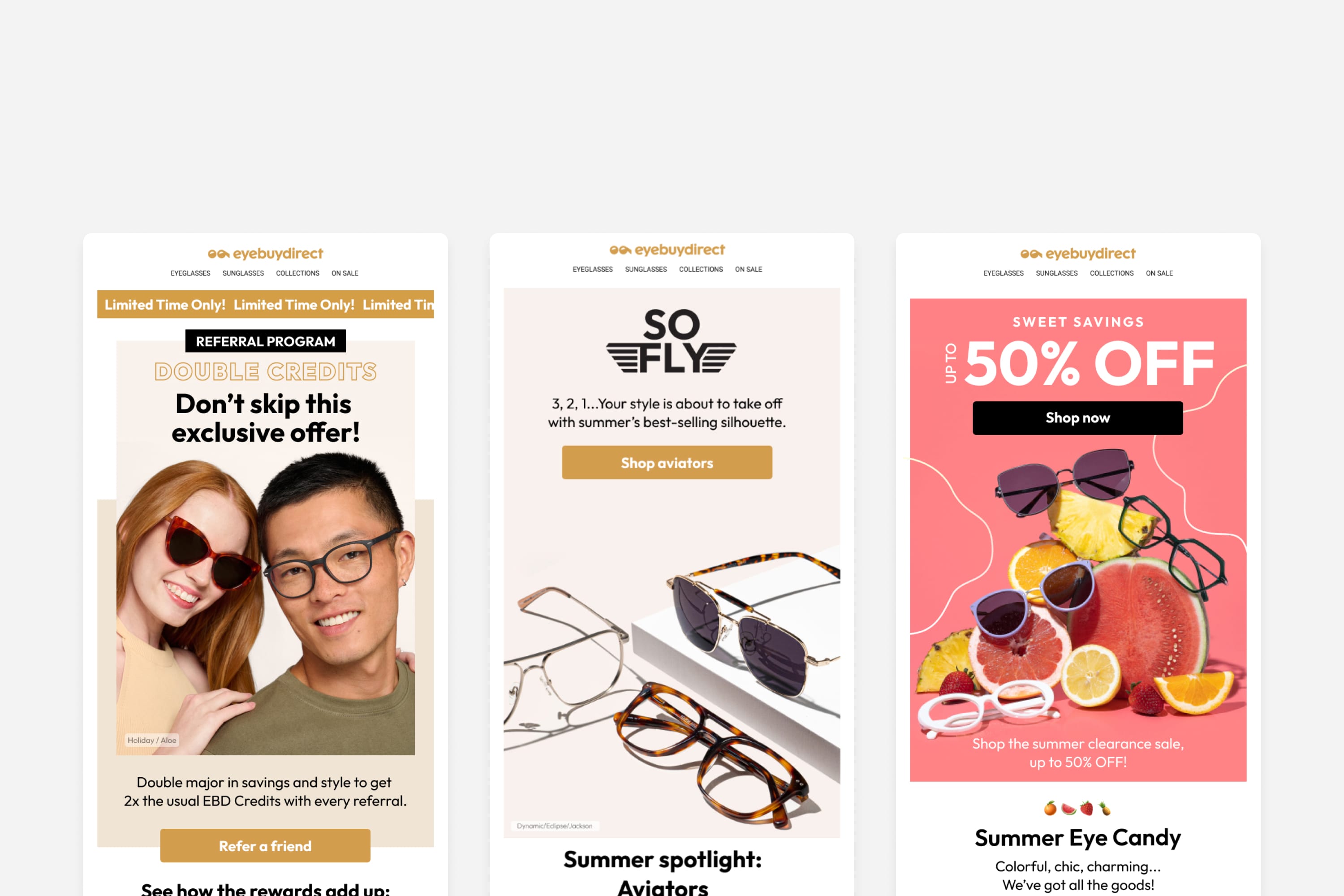
One of the key challenges was that much of the existing communication was heavily promotional and transactional. While effective for short term sales, it lacked a clear lifestyle narrative and emotional connection with customers.
The opportunity was to evolve the brand’s visual language to feel more modern, human, and expressive while still supporting the performance driven nature of e-commerce marketing.
The opportunity was to transform a sales driven brand into a visual story customers could connect with.
Evolving the Visual Identity
The visual identity was updated through a deeper understanding of customer behaviour, marketing data, and campaign performance insights. By analysing how customers interacted with the brand across digital channels, we identified opportunities to create more authentic, engaging, and product focused content.
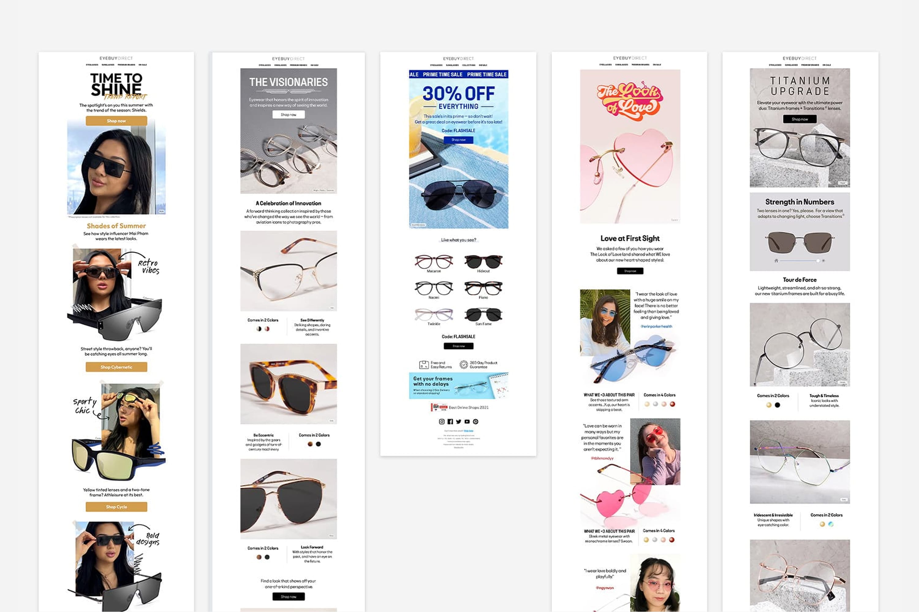
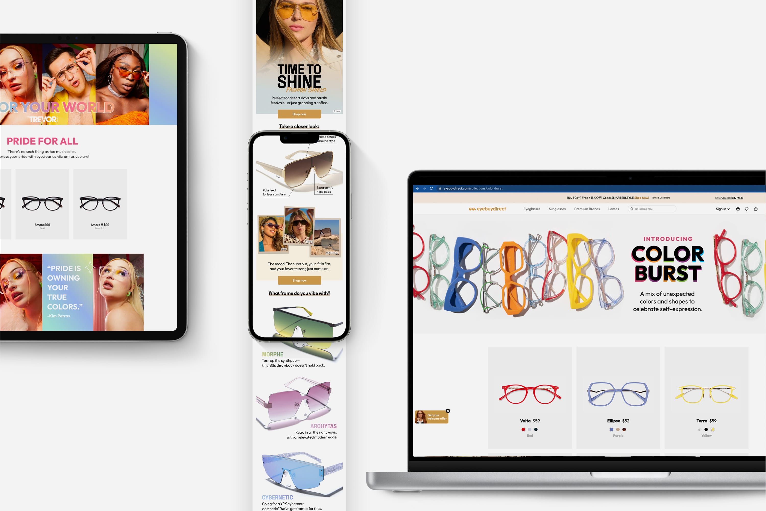
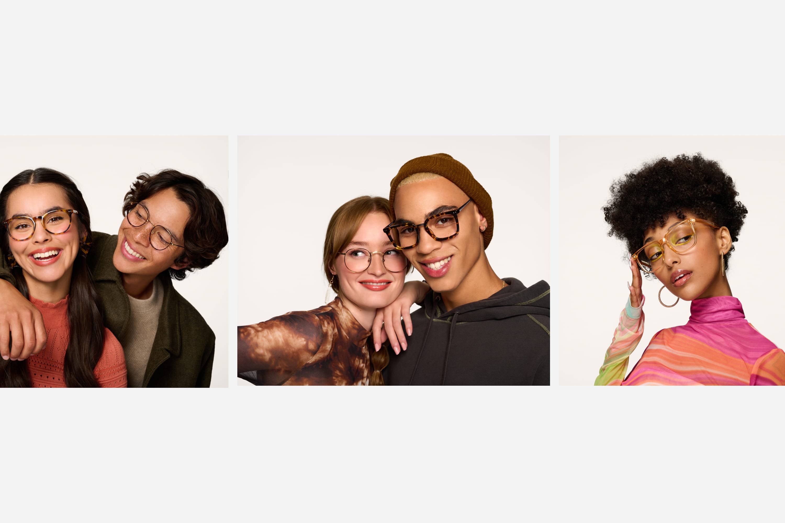
The new visual direction prioritised product led photography, ensuring frames remained the hero of every campaign. We also introduced user generated content to make the brand feel more relatable and closer to everyday customers.
Instead of generic product shoots, campaigns were developed with clearer art direction and storytelling, creating stronger visual narratives around different collections and promotions. This approach helped evolve Eyebuydirect’s communication from purely promotional assets to a more engaging and lifestyle driven brand experience across marketing channels.

Celebrating individuality through a more expressive visual identity.


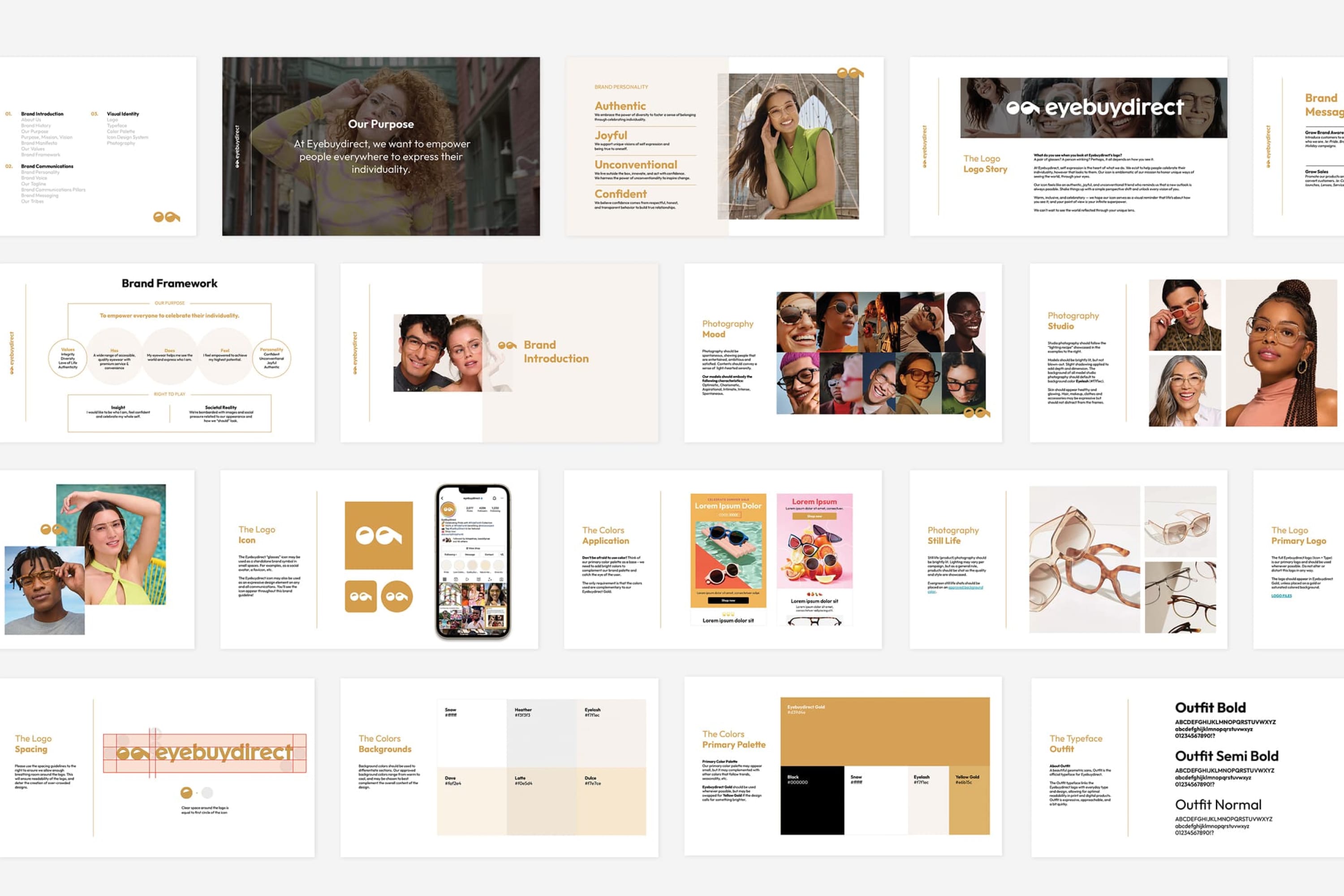
UI & Brand Guidelines
To support the updated identity, a comprehensive set of brand guidelines was developed to ensure consistency across digital and marketing channels. These guidelines defined clear standards for logo usage, colour application, typography, photography style, and graphic elements.
The visual updates were also reflected across key digital interfaces, including website components, campaign landing pages, and email layouts. Improvements in layout structure, visual hierarchy, and product presentation helped create a clearer and more engaging user experience while maintaining a cohesive brand presence across all touchpoints.
This project reinforced the importance of aligning design decisions with real customer behaviour and performance insights. By combining brand thinking with marketing data, we were able to evolve the visual identity into a more expressive and scalable system that supported both storytelling and e commerce performance.